Dev Log #7 - Second beta testing results! Where can we improve?
Second Playtest Results - William W
The jump of improved quality from Playtest 1 is easily noticeable here! There’s now images for the story scenes, the background now has a shader that makes it move, the combat scene is now animated, and major QOL problems from playtest 1 (such as the proceed dialog button) is also here! It took a lot of learning code to write the functions we wanted, but eventually we got it.
It's not completely flawless though, we’re still missing sound effects and music, the major QOL addition also has its own problem where sometimes the dialog won’t continue even though you’re pressing the button, and the combat balancing leaves a lot to be desired. We also noticed some misspellings that was already fixed when the playtester played the game, but weren’t pushed out to the main build.
Overall though, we are happy with the results of the playtest for this week!
About Extor Wiki - Kylie N
Initially, our artist was concerned that players would not understand how the battle system works since adding numerical feedback and pop-up tutorials was quickly becoming out of scope due to time constraints and busy schedules. Our artist brought up the idea of having a Help/Information page during the battle but as a team, we decided that it was far too much reading for them. So we turned that information into an Extor Wiki page just in case players had difficulty understanding the mechanics or wanted to read the logic and maths behind the battle system. At the end of our second playtest, we were pleased to hear that someone with little experience in playing JRPGs could still play through the game without needing to read our wiki page.
UI and Vector Art - Kylie N
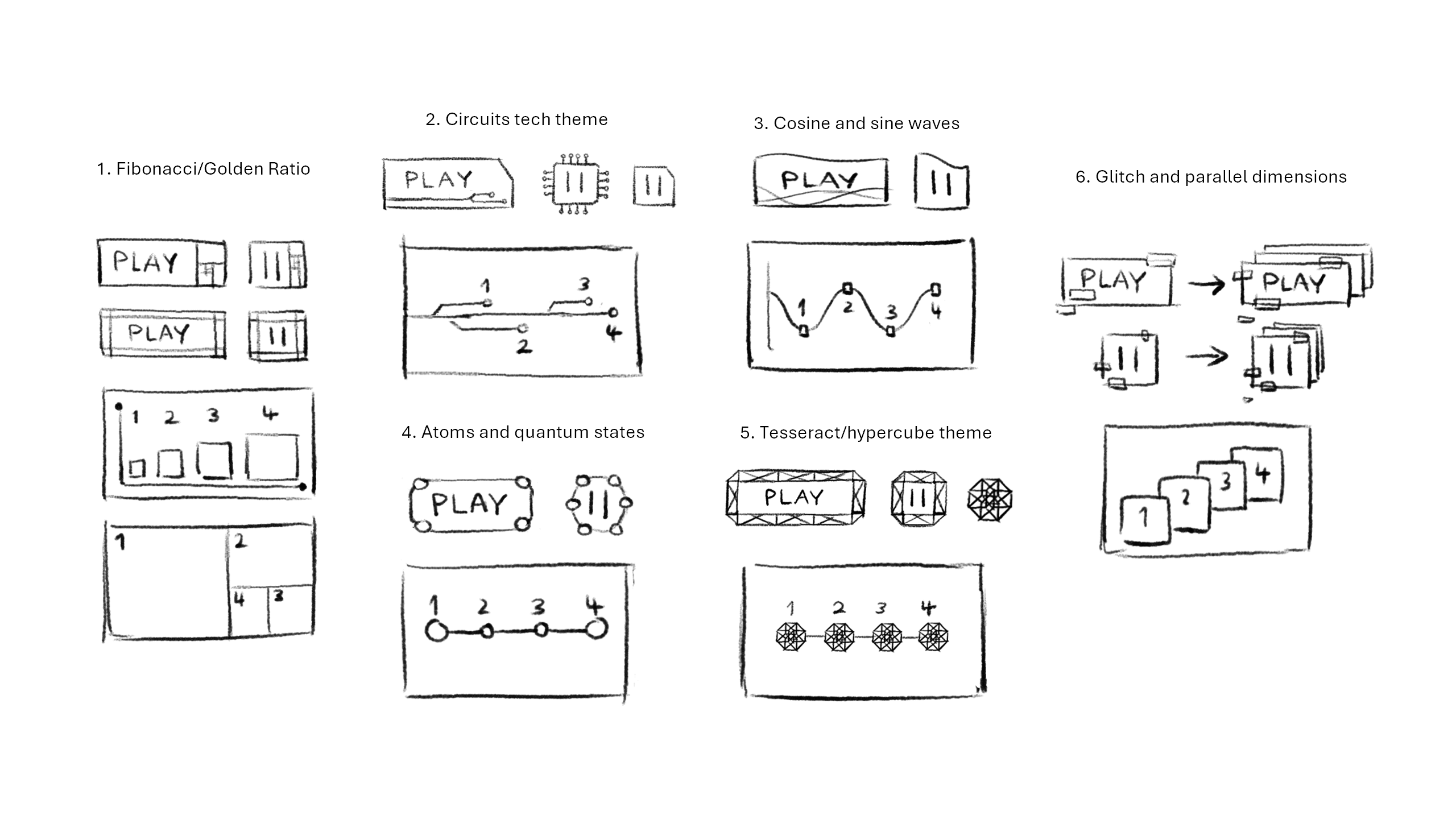
From previous experience, the user interface should be considered in the early stages of game development as it helps the player navigate through the game with ease. After many iterations of sci-fi concepts, we settled on the wave design using both red and blue themes. UI became something the artist worked on at regular intervals during the project development cycle. The learning facilitator provided feedback on the placeholder health bar UI elements, which was something we almost missed because we were too preoccupied with the development process. It also prompted our artist to revamp the UI and reorganise its folder system.
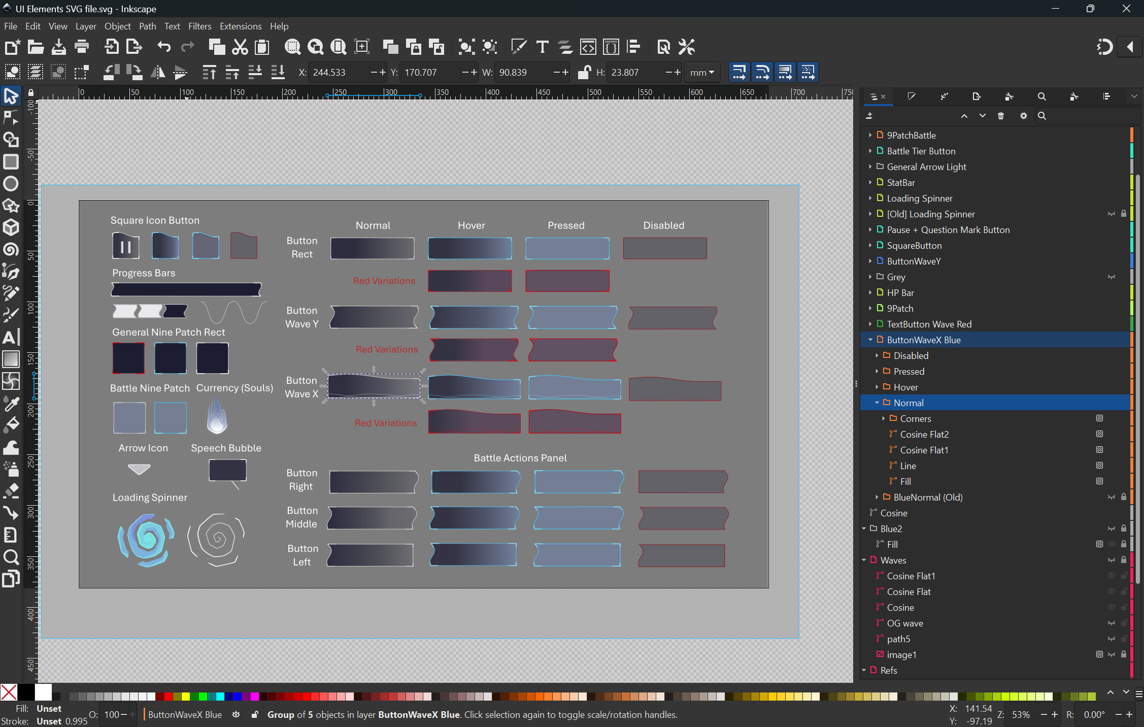
While the concepts were done in the paint program Medibang Paint Pro, the in-game UI assets were created in the vector art program Inkscape. Although our artist faced some learning curves, the major advantages of using vector art include the fact that layers are non-destructive and graphics can be resized without losing quality. The common tools used for our game’s UI design include the Pen tool (Bezier curves), gradients and booleans.

UI Concept Sketches by Kylie

Final UI Assets as shown in Inkscape
The Artist’s Reflective Comment - Kylie N
At first, our learning facilitator was unclear about our game vision which unfortunately couldn’t have been improved since we lost 12 weeks of pre-production work including concept drawings and prototypes. Fortunately, our team always had a clear vision of our game mostly due to having lots of experience playing JRPG-type games, however, having an outside perspective of our development process is something to take on board in the future.
Overall, I am very happy with how our game has turned out. Working as the project’s solo artist, I realised the hard work and importance of each creative discipline such as concept art, narrative writing, design, sound, animation, motion graphics, asset implementation, UI, UX and VFX. There were several times I thought to myself: if only I had more time for this. Although the pre-production capstone unit was helpful to the extent that it provided the game’s framework, 12 weeks of recreating all art assets left little time to develop carefully thought-out concepts and design sketches. Occasionally, I was overwhelmed by which art aspect our team wanted to focus on but our team meetings helped me reprioritise my tasks.
Our designer and programmer did an excellent job bringing our game together. Of course, there are still many aspects we could refine in this project and we did have to reduce the scope at times, but this project has allowed me to apply all the skills I’ve built up over my university years while also learning new ones. Considering time constraints too, I am highly pleased with the final outcome.
Audio Production - Blake H
With the framework complete and William working on fixing bugs, I pulled my trusty keyboard out and set to work creating background audio and sound effects to be used. After deciding on the overall theme and mood of each scene, I then created short looping audios that matched.
Overall, despite the roadblocks, this is and has been an enjoyable project to work on. Which has given me the knowledge and skills to build a framework from scratch as well as the opportunity to practice my hobby of sound production.
Get EXTOR: ANNIHILATION AVERTER
EXTOR: ANNIHILATION AVERTER
2D turn-based combat JRPG inspired by soulslikes
| Status | In development |
| Authors | Firezaga, KylieN, Damstructions |
| Genre | Role Playing |
| Tags | 2D, Fantasy, Sci-fi, Singleplayer, Space, spacefantasy, Turn-Based Combat |
| Languages | English |
More posts
- Dev Log #8 - Final release!Aug 25, 2024
- Dev Log #6 - The Game Dev Experience and AnimationsAug 15, 2024
- Dev Log #5 - Beta testing! Game name! Oh my!Aug 09, 2024
- Dev Log #4 - Extor is born: Story, characters and mechanicsAug 07, 2024
- Dev Log #3 - World creation: Setting and environment firstAug 07, 2024
- Dev Log #2 - About AI and emerging techAug 07, 2024
- Dev Log #1 - Where it all beganAug 02, 2024
- Extor WikiAug 02, 2024

Leave a comment
Log in with itch.io to leave a comment.