Dev Log #5 - Beta testing! Game name! Oh my!
Names.
Dear God.
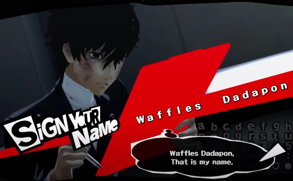
Naming anything can be really difficult; at some point when choosing a name, you realize the level of permanence that it can force for (or against) you. You live with the consequences that come with it, whether you realize it or not.

There are no shortages of really good titles out there on the current market of media. “Final Fantasy”, “Oldboy”, “Persona”, “Call of Duty”, “Titanfall”. These are all, in some way, shape, or form, household names to people. They’re catchy, quickly recognizable and even fit the theme of the game. As a result, they also make the marketing aspect significantly easier; people start to attach what they saw with the theme, color palette, gameplay, etc. to the name into memory.
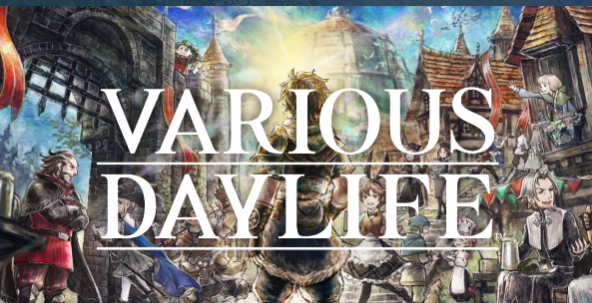
Naming is actually a more difficult aspect of game development to us. We first started to source our name via the inspirations we took; mathematical equations, big numbers and a bunch of golden ratios were the start of our search for this game name. All of them felt so awkward that we had forgotten each and every single one of the names we proposed within this theme. To me (William), this is reminiscent of that one time Square Enix released a game named “Various Daylife”. A classic JRPG style game that also involved “Various Daylife” things. I suppose that the name did fit the theme of the game, but the name never stuck to people beyond how awkward the name is…

In the end, we settled upon a temporary name “Extor”, but later realized that this might be the best name for the game: It’s written in the similar vein of an urban legend (think “David and the Goliath”), it’s catchy and quick, then there’s the fact that the protagonist’s name isn’t just highly unusual, it’s also representative of their main goal… “exterminator”.
Game Logo Title and Icon Design
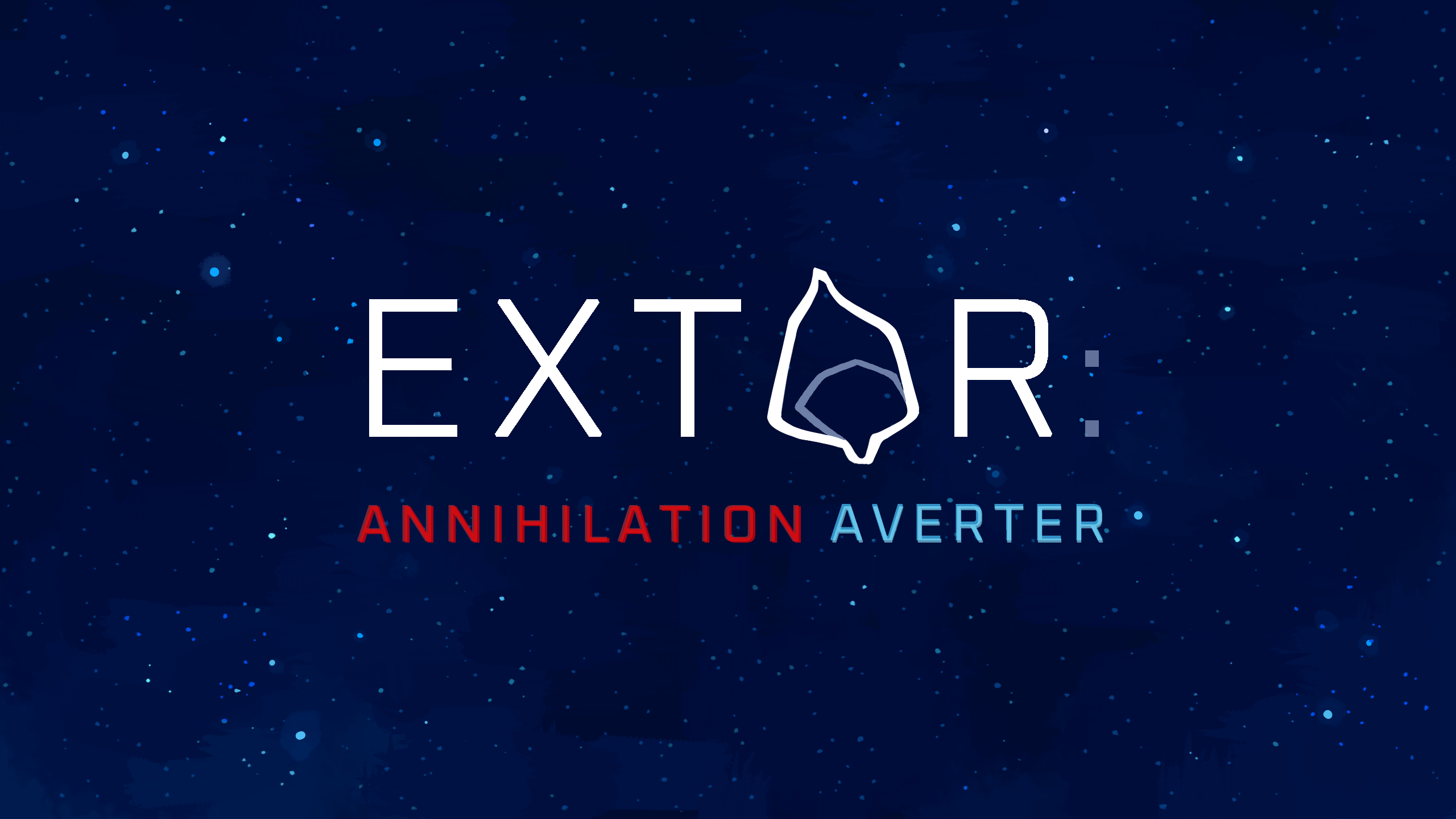
Our artist studied other RPG and JRPG logo titles and icon designs, finding that most of them have a symbolic design or character that is important to the storyline in some way. While we wanted to keep our title futuristic, we still wanted to emphasise the story focus of our game, hence, we made our main character Extor’s face our game icon and also incorporated them in our logo title. The font we chose had a balanced feel, not too futuristic or ancient, and most importantly, it’s sourced under the Open Font License. We also decided to have two additional colours in our title — the red and blue match our game UI but also highlight the main mission of Extor: Annihilation Averter.
Beta Test Results
In a surprising twist of results, our beta test actually ran much better than expected. Many of the issues that were outlined by the player were already expected, with Quality of Life features only being the outstanding issue we weren't expecting. The player also struggled to use the battle system properly, so we're looking into ways to help those not familiar with the interface be able to utilize all actions in the game. This still means we have a long way to go before the game can feel satisfying to play though, so we're still not going to relax until we feel the game is ready to play to the untrained eye.
Files
Get EXTOR: ANNIHILATION AVERTER
EXTOR: ANNIHILATION AVERTER
2D turn-based combat JRPG inspired by soulslikes
| Status | In development |
| Authors | Firezaga, KylieN, Damstructions |
| Genre | Role Playing |
| Tags | 2D, Fantasy, Sci-fi, Singleplayer, Space, spacefantasy, Turn-Based Combat |
| Languages | English |
More posts
- Dev Log #8 - Final release!Aug 25, 2024
- Dev Log #7 - Second beta testing results! Where can we improve?Aug 15, 2024
- Dev Log #6 - The Game Dev Experience and AnimationsAug 15, 2024
- Dev Log #4 - Extor is born: Story, characters and mechanicsAug 07, 2024
- Dev Log #3 - World creation: Setting and environment firstAug 07, 2024
- Dev Log #2 - About AI and emerging techAug 07, 2024
- Dev Log #1 - Where it all beganAug 02, 2024
- Extor WikiAug 02, 2024

Leave a comment
Log in with itch.io to leave a comment.